
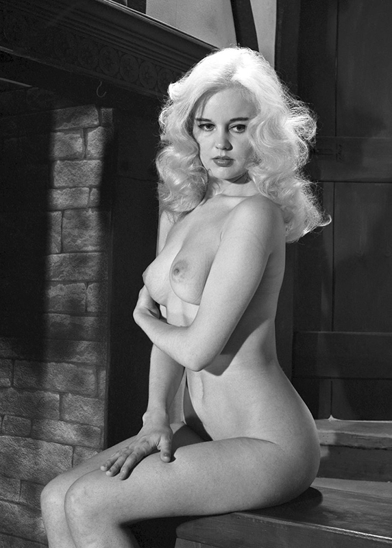
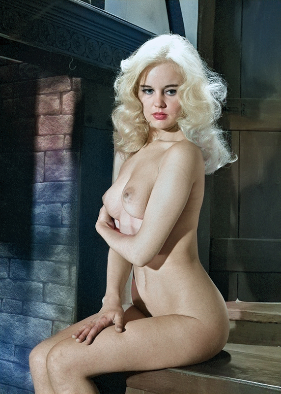
Another coloured creation, this time one of Toni Ash by Harrison Marks. I’ve come to the conclusion images of models in the studio are easier to colour, as trying to colour the model and background and foreground objects is much harder!
Dedicated to the published work of Harrison Marks & other prominent photographers of the 1950's, 60's and early 70's. Along with popular glamour models such as June Palmer, Pamela Green, Dawn Grayson and others
Another coloured creation, this time one of Toni Ash by Harrison Marks. I’ve come to the conclusion images of models in the studio are easier to colour, as trying to colour the model and background and foreground objects is much harder!
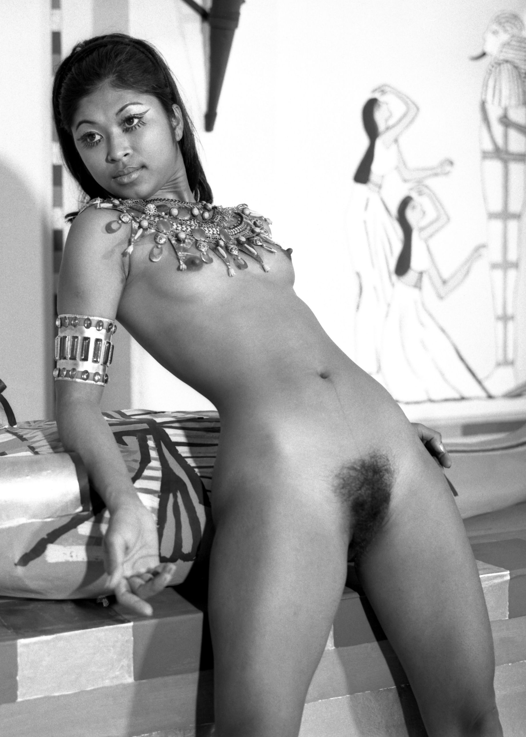
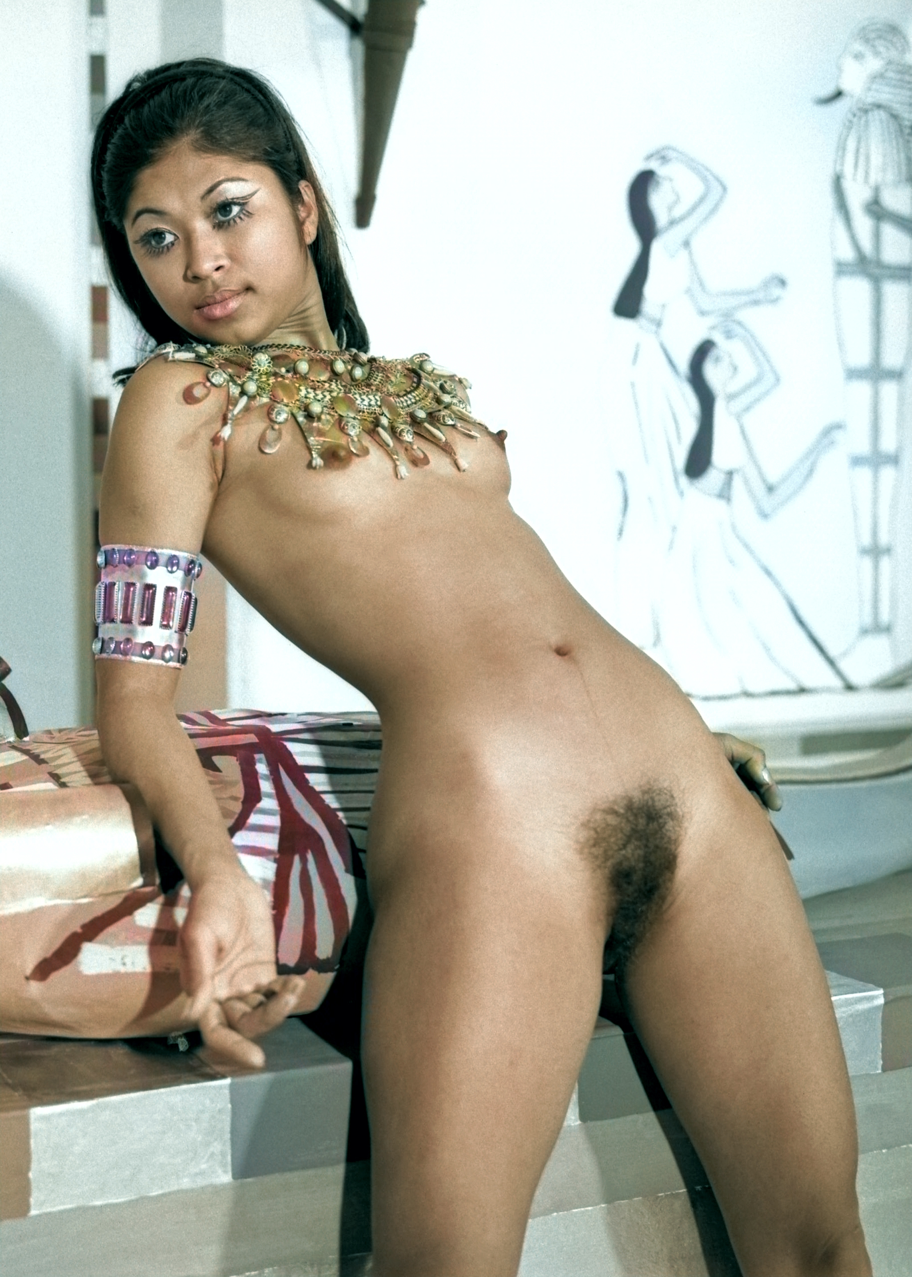
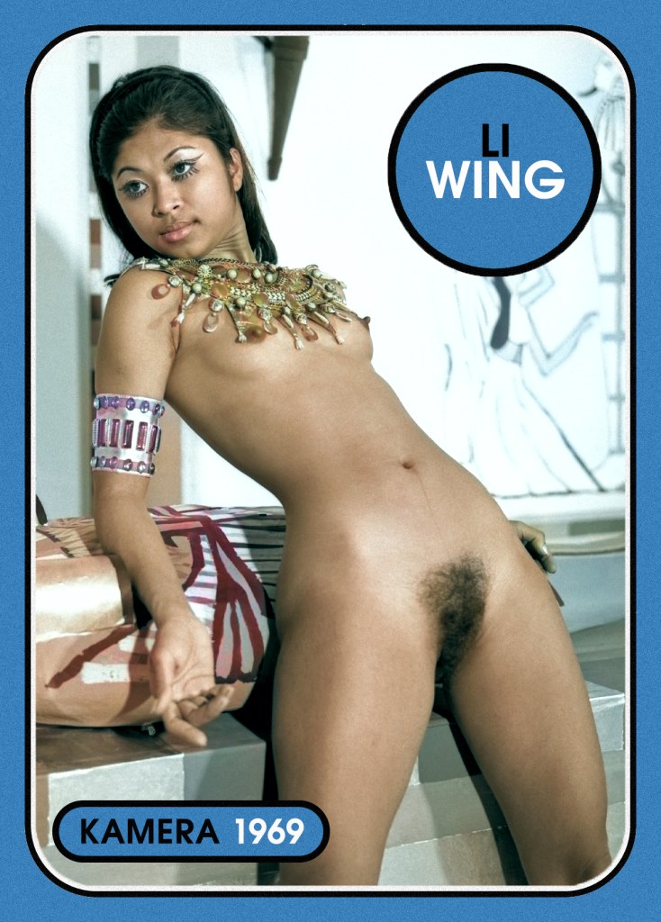
This has to be one of my best and favourite coloured creations. Li Wing taken by Harrison Marks on the Egyptian set in 1969. Skin colouring and tones are so difficult to accurately colour, especially on models with colour. Throw in coloured jewellery, and it’s a real challenge, which is why like this conversion, as I think I got both pretty spot on.
Over the last 6 months or so, I’ve been dabbling in colouring some of my black and white images, as well as creating trading cards for some models. I’ve now created a few small galleries, so you can view some of my creations to date. These are only a small selection, and I’ll be adding more in due course. :)


The fabulous Doreen Pierre on the cover of Girl Illustrated. No, it’s not the original cover, but one created by myself, along with a coloured image.
Over the last few months, I’ve been playing with some of my original images and trying to add a bit of colour. The success has been mixed, with some looking like a genuine colour image, with others looking exactly like they have been coloured.
Here is a before and after shot of Annette Johnson, where you can move the slider to see more or less colour. I think this one came out pretty well. I know there are those that prefer only the original black and white shots, but interesting to see how it might have looked in colour. Let me know if you want to see more of my coloured creations like this, as I did quite a lot! :)


An original print of 1960s model Wanda Adams. Another model with a fantastic curvy figure and more! I’ve also included a coloured version of the same shot, done by myself, as I always wonder what they would look like in colour. :)

The beautiful Vera Petrov by Terry Sparks. Taken posing in a doorway, we get a great view of Vera, her slender figure, small tits and just a hint of natural bush!
This comes from a set of 10 contact sheets in my collection featuring over 100 images of Vera. So plenty more of this beauty to come!


Over the last few months, as well as continuing to edit my vast archive, I’ve also been playing around with colouring some of my original images. In the past I’ve avoided this as I’ve seen various attempts to do this with varying degrees of success. Most are either too skin toned in colour or end up having a painted effect and losing the details.
So after many years of using various tools to edit photo’s I gave it a go! The aim being to create a coloured version that looks as though it was originally taken in colour without losing the details. The above shot of Tina Graham is one of my better attempts, as for every successful coloured version (In my view!) I had about 8 failed versions. Some photos lend themselves to colour, whereas others have too much going on to get the colouring looking right.
I know some of you out there hate the idea of originals being coloured, and I totally get that. This is more of an experiment to see how close I can get to an authentic colour version. I have a small gallery of different models I’ve tried, and I sneaked a few onto the site in the last few weeks (guess which ones?)
So, what do you think? Success or fail, good or bad, and want more?
