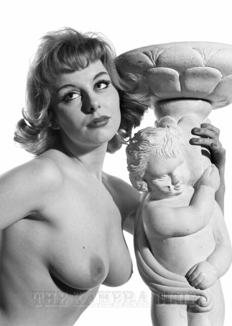

Over the last few months, as well as continuing to edit my vast archive, I’ve also been playing around with colouring some of my original images. In the past I’ve avoided this as I’ve seen various attempts to do this with varying degrees of success. Most are either too skin toned in colour or end up having a painted effect and losing the details.
So after many years of using various tools to edit photo’s I gave it a go! The aim being to create a coloured version that looks as though it was originally taken in colour without losing the details. The above shot of Tina Graham is one of my better attempts, as for every successful coloured version (In my view!) I had about 8 failed versions. Some photos lend themselves to colour, whereas others have too much going on to get the colouring looking right.
I know some of you out there hate the idea of originals being coloured, and I totally get that. This is more of an experiment to see how close I can get to an authentic colour version. I have a small gallery of different models I’ve tried, and I sneaked a few onto the site in the last few weeks (guess which ones?)
So, what do you think? Success or fail, good or bad, and want more?
I am not a fan of colourised photos. However, you have done a really good job here and it doesn’t look as if it has been colourised – which is the whole point!
LikeLike
Exactly what I wanted to achieve, if you didn’t know it was colourized and thought it was originally colour, then I’ve achieved what I wanted to do :)
LikeLike
O trabalho esta bom ta ruim nao agora tem aplicativo de cores que as vezes nao mostram as cores realmente como deveria ser realmente eles não advinha
LikeLike
By default I prefer B&W images to stay that way – for me it is a key part of the vintage, nostalgic look. “You remember the black and white days”. You also need to remember that colour film of the 50’s and 60’s wasn’t that accurate in reproducing the true colours anyway – and that is before the effects of time on the quality of the neg or slide! So you need to be vary careful about what gets called “true colour”. So an ideal for me would be to show the B&W original as well as any coloursied version; and at the very least ‘fess up that an image has been colourised (which might well generate compliments!).
LikeLiked by 1 person
Totally agree as even I prefer the originals and 90% of what I own is B&W. Just my curiosity seeing if I can produce a colour version that doesn’t look as though it’s been artificially coloured.
LikeLike
I’ll stick to black and white but having said that, a colour picure thats converted to black and white seems to lose its clarity. So, given the choice, its black and white originals for me.
LikeLiked by 1 person
I know you don’t like coloured versions Phil ☺
I’m with you on the clarity, which is why I hadn’t tried before now
LikeLike
Excellent job on the picture of Tina Graham! Love the coloured versions, but like the B&W included for comparison.
My guess is maybe Yvonne Vella and Lisa de Leeuw were coloured B&W images?
LikeLike
Well for me it’s black and white all the way but I have to say you’ve done an excellent job with the colouration.
LikeLike